Nails & Needles

Of knitting and nail polish

Archive for the category “Swatches”

Isadora Jewels of the Orient (Fall 2012)

When Isadora first annouced its fall collection for 2012, I had a feeling I’d be all over it. I was right!

Initially, I thought I’d end up getting them all, but once I saw them in person, there were some I didn’t particularly fancy, so I skipped those. I got six of them: Beetle Green, Black Amethyst, Ancient Ruby, Oasis, Silk Road and Peacock.

I’m late showing them off, I know, I know. That’s what happens when there’s no internet connection to be had. These have been photographed and ready to go up since early November, but I haven’t had the time or inclination to post until now. Oh well.

Speaking of time and inclination: I was kind of lazy when I swatched these as well. For most of the colours, I only did one nail, so I could get four in one go. Bad, nail blogger, bad.

IMG_2239

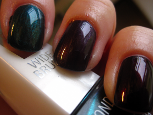
Beetle Green (index finger) first made its appearance for fall 2011, but since I wasn’t into nail polish back then the way I am now, I missed it at that point. After drooling over pictures of it online, I was over the moon to see it back in this year’s fall collection. It’s a gorgeous blackened green metallic, quite reminiscent of a beetle (so good name choice, Isadora!). Two coats gives full cover.

IMG_2245

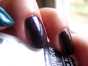
Black Amethyst (middle finger) is a deep blackened purple with a very fine silver shimmer suspended in the base. Again, two coats are enough for complete cover. If you’re careful (which I’m not, usually), you might even get away with just one coat of this.

IMG_2249

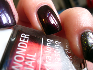
Ancient Ruby (ring finger) is a deep, deep blackened and shimmery red. Quite by coincidence, I discovered that it’s, if not a perfect dupe, then at least very similar OPI’s Every Month is Oktoberfest. Killed that lemming for me! One coat could be enough for this polish, but I like a second coat to really deepen the colour and make it look like my nails are glowing from within.

IMG_2255

Oasis (pinkie) reminds me a lot of H&M’s 0516 Black. Both are dark grey jellies with gold and blue microglitter. The biggest difference is that the blue glitters in Oasis seem to be duochrome and look purple from certain angles. The base colour also appears to be slightly darker at three coats, which is what you need for full cover. (And if you let it dry properly before trying to do things with your hands, you don’t get unsightly marks ruining your polish. ::cough::)

IMG_2265


IMG_2262

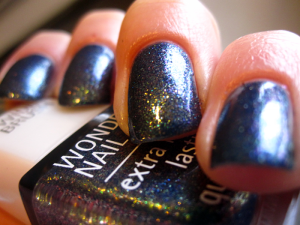
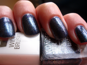
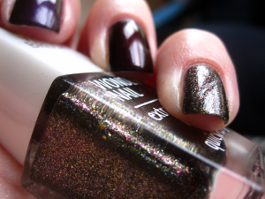
My favourite in this collection is Silk Road, which is a blue/purple duochromatic glitterbomb. So gorgeous! I really wish photos did this one justice, because oh my! In the bottle, it doesn’t look all that special at first, but then when you get it on your nails — oh dear! First time I wore it, I went around showing it to anyone who’d look for just a second.

As the base is a jelly, this does require three thin coats to fully cover any VNL, and you have to wait a little while between coats unless you want cuticle drag. Those minor inconveniences aside, this is such a stellar polish! I think it could possibly be a dupe for OPI’s On Her Majesty’s Secret Service, or at least it’s very similar.

Cactus’ Nail Polish Magnesium

My first indie! And it’s probably so indie you’ve never even heard of it. =P

Cactus’ Nail Polish is a blog I follow and a while back she made her first nail polish collection. The day they went on sale, I was away from home so I was convinced I’d miss out completely. As luck would have it, though, my favourite shade was, for some reason, the least popular one.

Magnesium is a green linear holo and I adore it. The formula is quite thick, but since the polish is very richly pigmented, one coat is enough for full cover and the thickness is not a big deal at all. It dries kind of matte on its own, so yes, I did use top coat on it. Oops?

Just as luck was on my side when I got my hands on this, it was when I went to swatch it too. The sun came out! For the first time in aaaaages — I’d almost forgotten what the sun looked like!

Cactus’ Nail Polish is apparently working on a new collection now, and I’m really looking forward to seeing what it brings!

Isadora Forest

Forest is from Isadora’s Fall 2011 collection. It, for some reason, stuck around in the permanent selection for quite a while, but now seems to have disappeared again (I was super stoked to find two bottles in a store the other day, as I’d not seen it for months and I have promised to get it for two friends, so was getting a little worried there).

This is a gorgeous forest green colour full of bronze shimmer. It kind of reminds me of Make Up Store’s Merit, in the way that they both make my nails seem like they’re glowing from within, but Forest is definitely green. Forest is really such a fitting name for it!

Isadora Polar Nights

I missed last week, but now I’m back on form for Blue Monday!

For Isadora’s Holiday 2012 collection, they have released three new nail polishes. One is a gold glitter, one is a silver glitter and one is a deep blue jelly loaded with silver and blue microglitter and larger hexes. I’m betting you can guess which one I decided to pick up?

Polar Nights is the aforementioned deep blue jelly. As a jelly, it does require three coats to cover completely (though three coats is not bad as jellies go!), but because of the glitters, this adds depth to the hexes, especially. It’s like a jelly sandwich without all the work.

Like most of Isadora’s polishes, this dries super shiny even without a top coat (though in the photos I am wearing a coat of Seche Vite on top).

I have to say, this is one of my favourite blue polishes and I’m so glad I got my hands on it (this was the last bottle left in the store!).

Make Up Store Charmaine (Shimmer 101)

First of all, can I just say how much I love the brushes on Make Up Store polishes! I think these may actually be my favourite brushes ever! They are very easy to work with and make the polish very controllable. Me likey.

Charmaine is a beautiful teal polish, shockful of holographic particles. It’s not a linear holo, but the holo effect is definitely there, which is quite odd. I mean, MUS have polishes that are clearly marked as holos, and this is not one of them.

Either way, this is so pretty, and it’s a one-coater! Gotta love a good one-coater! And this one is good. Very good. Very, very good.

If you’re going to buy only one or two MUS polishes, I’d say to go for this and/or Merit. No doubt about it.

Not going to stop scratching my head over the supposed non-holoness of this, mind.

Make Up Store Merit (Sparkling 001)

Merit was the first Make Up Store polish I ever bought and well worth every penny I spent on it. It’s been one of my favourites all autumn and probably will be even after winter comes.

The base colour is a rich warm chocolate with copper shimmer and microglitter. Two coats (one thin, followed by a more generous one) are enough to give full opaqueness and make your nails look like they’re glowing from within.

Every time I’ve worn this to work, I’ve had customers asking me where I bought it and exclaiming that they have to get it. Can’t say I don’t understand them! I would crave this too if I didn’t already own it.

Make Up Store Tanja (Shimmer 101)

I wasn’t very interested in this shade when I first picked it up to look at it in the store, but then the light hit the bottle at just the right angle and holy wow!

This is a dark greyish green base with, mainly, green microglitter suspended in it. I think there is an element of duochrome in some of the glitter particles too, however, because sometimes you can catch a glimpse of a little red in it as well.

The shimmer effect in this is very, very subtle, almost completely muted by the base colour. But then, like at the store, the light hits it from just the right direction and suddenly the sparkles appear! Honestly, that’s half the charm of this polish. Unfortunately, this also makes it quite tricky to catch the effect in photos. Pictures just don’t seem to do this polish justice at all! (That’s why sucky flash photo is included.)

I needed two coats this time, but with careful and methodical application, one generous coat might well be enough to do the trick.

Illamasqua Christmas 2011 Quad

I know, I know, we’re coming up on Christmas 2012, so yes, I am a year late. But, never you mind that: this is still a great little set! It’s also my introduction to Illamasqua’s polishes. Normally, these babies run at £13.50 a pop, but I snagged them up at Illamasqua’s summer sale a few months back. Who wants Christmas polishes in July? For £15 for the four of them, I sure as hell do! ;)

Prism: There was one polish in the set I was certain I would never use, because I hate sheer polishes, but hey, three for £15 is still a pretty good deal!, so I didn’t really care that one would be unusable. Of course, once I had it in my hands, I had to at least try it once, y’know? So I did, and I was sold! Prism is gorgeous! It’s a sheer, milky duochrome that is obviously never going to be opaque on its own, but  I don’t care! I’m wearing two coats here just to show what it looks like by itself. I can’t really wear it this way since my nails are crazy discoloured, but it also works perfectly as a layering polish over something else.

Elope: Lovely grassy green colour, really annoying formula. It took four coats to begin looking this even and non-streaky. Thing is, this is a wonderful colour and I want to wear it a lot, but boy, do I not have the patience for four-coater nightmare polishes! Next time, I’m wearing underwear with this. Will certainly save a looooot of time.

Throb: A gorgeous vibrant red creme and a nice surprise after Elope. I dreaded another four-coater, but this ended up only taking one coat to cover completely. One. What is this? Not that I’m really complaining — yay for one-coater reds! Great for when you’re in a hurry and so on, but consistency, anyone? A bit of that would be quite nice now and then. Just sayin’.

Harsh: What’s a Christmas collection without a glitter polish? Nothing, that’s what, so of course one was included here. Harsh feels very aptly named. It’s got to be the harshest silver glitter I own (and OPI’s Pirhouette My Whistle is the softest). Here it is as one coat over Throb. Much like Prism, Harsh is best layered over something else, though obviously you can wear it on its own, if that’s what floats your boat.

All in all, the brush on these demanded a certain amount of concentration on my part, but I think that’s just because this is a new brand for me. I always need a little time to get acquainted with a new brush.

My favourite of the four is Throb, the biggest let-down is Elope and the biggest surprise Prism. All of them quite worth the £15 I spent.

H&M Five Polish Pack

I’ve already shown you one of these five little goodies on a Blue Monday, but here’s the whole lot!

0514 Red: I’m having a hard time figuring out if this is a creme or a jelly. It both looks and behaves like a bit of both, so I guess it’s kind of a cross? Needs three coats if you want rid of VNL, though it’s not as obvious at two coats as the photo would have you believe. The colour is also a bit darker/deeper in  reality than what the picture shows, but my camera (like so many others) absolutely hates red shades.

0515 Pink: I’m not at all a fan of pinks with shimmer, but I actually don’t mind this one as much as I thought I would. Maybe because it’s more like gold microglitter, rather than shimmer. Well, that, or I’ve just myself put myself in the way of enough shimmery pinks that I am now starting to get immune to their wiles. ;) Anyway, two generous coats and Bob’s your uncle!

0516 Black: This is a dark grey jelly base with gold and blue microglitter. The first coat is very sheer, but it actually only needs three to become opaque, which was a nice surprise. If you don’t mind VNL, you might even be content with two, although then you’d have to settle for a medium grey colour. Even at three coats, I wouldn’t quite call it black, but I can see how “Really Dark Grey” makes for a less than stellar colour name.

0518 Blue: Three coats of this gives you a beautiful blue with silver shimmer and no VNL. This may well be my favourite of the five polishes in this pack. In fact, this is the one I mentioned showing you before: I featured it for my second Blue Monday (and how my nails have grown since I took that photo!).

Nail Polish Matte: Is this the best matte top coat I’ve ever tried? No. Is it the worst? No, not that either (I’m looking at you, Depend Matte Top Coat. You suck!). It’s actually quite decent and if I didn’t already have a bunch of others, I’d have appreciated this one a lot more!

Overall, this is a really nice little collection of polishes. The formula on all of them is nice and easy to work with, as are the brushes. The only issue I have (aside from the shimmery pink ::cough::) is the brush handles. They store a lot of polish, so if I don’t pay close attention to what’s going on with them, I risk dripping polish all over the place. I mean, I like nail polish, but I’d rather it go on my nails than on my clothes and furniture, thank you very much.

H&M Blue Bliss

 Remember how I talked about the many uses of a good black creme polish? Here’s a perfect example of what I mean!

H&M Blue Bliss is a sheer blue jelly polish with small hex glitters in red, green, blue, teal and gold (and I think even some holos). On its own, even three coats leaves it extremely sheer and makes you look like you’re about to freeze to death. A look some may like, but certainly not one I strive for on a daily basis… ;)

If you layer it over black, however, it’s instantly transformed and the glitters really come through. Over black, it’s like a completely different polish: one at least I can’t stop looking at!

It sparkles and glitters and shifts colours as you move your fingers. Absolute brilliance!

Formula-wise, it’s easy to work with and dries quite quickly, unless you apply multiple coats. There’s no reason to do that, though, as the glitters come out of the bottle quite willingly and you don’t need more than one coat over your base to really make it pop.

H&M Look At Me

Remember Lady Luck from a week or so ago? Here’s another shimmery gem I picked up from a later trip to H&M.

It’s called Look At Me and I can guarantee that that is exactly the statement your nails will make when you wear it. It’s a very vibrant, very shimmery red with an intense glow “from within.” I love it! (I wore it over OPI Lady in Black on my index finger, to see if the black made a big difference, and while it does make the glow deeper, it’s not absolutely necessary to make it look good.)

Like Lady Luck, this does run the risk of having brush strokes dry apparent, but with a little care while applying, it’s not really an issue. The formula is a little thin too, so if you have too much polish on the brush, you end up with fingers looking like mine in the photo here. ::cough::

All in all, lovely little thing, this. I can see myself wearing it for Christmas.

OPI Lady in Black

 I think young people these days are less likely to have a “little black dress” than they were a few decades ago. (I swear I’m not as old as that statement makes me sound!) It’s a pity, in my opinion, because the little black dress is such a versatile thing to have in one’s closet.

A good black creme is the “little black dress” of the nail polish world. It’s a great start for a lot of different styles of nail art. You can use it as a base under glitter polishes and layer it under other polishes where you want to make the colour deeper. Every polish addict should have one, and I dare say every polish addict does.

Until recently, my go-to black creme was Isadora’s Gothic black, which is awesome: it covers in one coat, dries quickly and is ridiculously shiny, even on its own. The only downside is that the bottle is quite small, and dries up quite quickly. I’ve employed my Seche Restore on it a few times already, but really felt I had to find a good alternative.

Enter OPI Lady in Black*. It’s super shiny. Super shiny! (No top coat used for these pics and look at those reflections on my nails!) It’s opaque in just two coats and you only need one if you want to layer something else over it.

Of course, swatching black polishes is kind of boring and it’s been done to death, but there you are. That’s what happens when a polish is a given staple in the collections of a lot of people with different tastes.

*I’m told this was previously known as OPI Black Onyx.

ELF Mango Madness

I posted about my first two ELF polishes the other day, and here’s my third! Purchased at the same time as the other two, this one is quite obviously a different shade.

I was swatching a little too late in the day, so the colour isn’t quite right, unfortunately. It has a much pinker tint than what the photos show. (I’ll try re-swatching at some point to get a fairer representation of it.)

That slight problem aside, it is a really gorgeous colour. Very summery, which makes it a bit of a pity that I only just tried in on now, when autumn is just about to start. There’s always next year, though! Or, of course, the prospect of what I like to think of as a vitamin injection for the darker months. =)

This is slightly more true-to-life, but still not pink enough.

Formula wise? It’s a bit thicker than the other two ELFs I tried. I think that’s the “new and improved” formula talking. Personally, I’m a big fan of the older version, so I’m not super pleased. To be fair, though, this isn’t bad, as such, just slightly thicker and harder to work with. I think I’ll survive it, though. ;) The worst is the fact that there’s still a hint of VNL even after three coats. Cool if you don’t mind VNL, but not so much if you do. I think I’ll layer it over a nude or white in the future.

Depend #260

Green! I love me some green! It’s been my favourite colour ever since I outgrew my all-black phase, which was close to ten years ago (yelp! I’m getting old(er)!). Especially darker greens set my heart a-flutter, so of course I look for those colours in my nail polish choices as well.

Here’s one from Depend, again without a decent name. It is simply known as “260”, which is short and efficient, albeit dead dull. The polish itself is not. Dead dull, I mean. I don’t know how a polish would be short and efficient, so I can’t say if it is or isn’t…

Aaaaanyway, sidetracked! 260 is a gorgeous dark green creme. It looks a lot lighter in the bottle than it does on the nail, and quite a lot greyer/dustier too. There is a grey-ish element to it even when applied and dried, but it’s a much less marked element than what the bottle would have you believe. The formula is quite nice. I can’t remember if I used two or three coats here, but three is probably better to get rid of the last streakiness, unless you apply it with utmost care.

ELF Desert Haze and ELF Innocent: two peas in a pod?

I recently discovered ELF’s line of polishes and various other sundries. I was smitten at once: here was a budget brand with a huuuuge selection, and it was cruelty-free to boot! Obviously, my shopping fingers couldn’t keep away, and I clicked home a nice little selection for my first order.

Pictured to the right here is ELF Dezert Haze, a lovely nude shade that applies rather like a dream and covers quite well in two coats if you’re careful (three if you aren’t!). The formula is on the extremely thin side, but for some reason (the brush?), I didn’t find it hard to control or work with at all. Apparently, some of the other shades from ELF now feature a “new improved formula” and if the one I tried (more on that later) is anything to judge by, this means the formula is slightly thicker and, in my opinion, a wee bit trickier to work with. Not by a lot, though!

And here’s another photo of Desert Haze, right? Wrong!

This is supposed to be Innocent. On the website, they both belong to the same colour family, but Desert Haze is shown as a darker version of Innocent.

From the ELF website.

For the life of me, I cannot actually see a difference. I’ve tried different lights, I’ve tried squinting, I’ve tried everything, but I can’t see it. Maybe I’ve not yet acquired “the trained eye”, but I honestly think I accidentally got a mismarked bottle of one of these.

Dezert Haze on my thumb, Innocent on the other fingers. Can you see a difference?

I e-mailed ELF about it and this is what they had to say:

Having compared both of the samples here in the office I appreciate your feedback regarding the colour. Although they are similar, I can advise that both have different shades. While the Innocent is more nude and pink, Desert Haze has more brown undertones.

While they may appear very similarly on nails, I assure you that when swatched, side by side on white paper there is a clear colour difference.

I’m just going to have to swatch again and really look for that difference, I suppose.

Depend #297

 Depend’s polishes nearly never have colour names, just numbers, so here’s the aptly(? How could you tell?!) named #297, a matte pink creme, from the summer 2012 collection.

I pretty much hate shimmery pinks with a passion. Some glitter I can stomach, depending on the sort, but shimmer is never okay in my book. I feel like that makes things too princess-y, too little girl-y and too grandmother-y — all at once!

So, that being said, I’ve been on the hunt for a perfect pink for a while now. It needs to be pink (duh!), but not shimmery, and preferably a creme or a jelly, that covers well in max three coats and lasts for a while before chipping. Not, exactly, an easy task to find the perfect one, then. You’d think it would be, since there is a veritable sea of pinks out there, but apparently that just means there are more imperfections to wade through to find The One.

This is not it, unfortunately (The One, I mean). It’s not bad, though. It’s a pink non-shimmer creme that covers in two coats and dries matte. Awesome, thus far. Too bad it’s not the shade of pink I’m after. =( Also, to be honest, I prefer my matte shades to become matte by use of a top coat, rather than being that way from the beginning. Yay! for versatility and all that.

All in all, though my hunt goes on, this is something I will definitely be wearing from time to time. Application was a breeze and it’s not a bad shade, so thumbs up!

H&M Lady Luck

Green and glittery? Don’t mind if I do!

I grabbed this from H&M a little while back along with some other goodies. I wasn’t actually planning on this one, but then I saw it and just had to have. Y’know, the way you sometimes just do? Yeah, like that.

It’s a little brush-stroke-y if you’re not careful, but with meticulous application (and it goes on like butter, so it’s easy!), it looks just fab. Glowing, even. I blame the micro glitters for that. I mean blame in a totally good way here, just so we’re clear. I like the micro glitters. I like them a lot. They are green and they are golden and they sparkle like mad.

Anyway, I can really recommend H&M’s Lady Luck if you want a bit of sparkly clover green on your finger tips!

Isadora Metropolitan

You saw Night Flight yesterday, so here’s the next one from Isadora’s autumn collection: Metropolitan.

Metropolitan is a straight-up creme with no bells or whistles (i.e. shimmer, glitter, whathaveyous). Does that mean it’s boring? NO!

The formula is fantastic and application is a breeze (forgiven my sloppiness evident in the photos — I was kind of in a rush while swatching. Seriously bad combination of things to be/do). It’s opaque in two coats and the colour is a dark taupe, kind of like really dark coffee with just a drop or two of milk. Amaaaaaazing!

Also, it’s really shiny. Isadora polishes usually are, even without top coat, which is one of the reasons I love them so.

Crappy flash photography that at least kind of shows that little bit of milk.

There’s a third polish in the Paradox collection, a deep red creme, but I haven’t bought it yet and I’m not sure if I will either. I have a lot of reds already, but my stash was lacking in brown and blues, which is why I picked up the other two colours first.

Night Flight

This is one of three polishes from Isadora’s fall 2012 collection: Paradox.  It’s a gorgeous dark blue metallic that covers in two coats, three if you want perfection, and I really, really like it a lot. It has a slight silver shimmer to it, which is absolutely lovely. Shimmers aren’t usually my thing, but here I think it really works.

I don’t think I’ve ever been really disappointed by an Isadora polish. They usually cover really well in just a few coats and they last an amazingly long time before they start to chip, especially if you use a good base/top coat combo.

I’ve only swatched this so far, but you can be sure I’ll be wearing it a lot this season.

Desert Sun

 Here’s the second of China Glaze’s On Safari polishes to appear on the blog, though it was actually the first I wore on my nails. I love it.

Last year, I bought a set of four mini polishes at H&M and one of them was a tan colour that I fell in love with, utterly and irrevocably. Of course, a defining trait of mini polishes is that the bottles are quite small, so my beloved tan polish dried up in no time.

Enter On Safari. After seeing swatches, I decided I must get my mitts on Desert Sun, but it wasn’t until I actually wore it for the first time I realised that, hey!, here’s my favourite colour in a big bottle that’s going to last forever. Awesome!

It’s a very easily applied creme formula, though I am not the best of friends with the brush yet. I need to get the CG brush technique down pat still, but once that happens? I will be unstoppable! ;)

Also, re: my last post and how I’m getting better at painting my nails without making a mess? Look at this photo. No clean-up was done after applying the polish, and while my cuticles maybe don’t look perfect, they’re damn well close to being so!

China Glaze Prey Tell

This polish from China Glaze’s autumn 2012 On Safari collection has got to be one of my favourites. I’ve been wearing it, on its own or paired with I Herd That (more on that one later!) nearly non-stop ever since it showed up in my mailbox.

It covers completely in two coats and I’m absolutely smitten with how dark it is. It looks almost black in some lights and really dark brown in others, but there’s always a hint of red in it. It is, quite seriously, the best.

Two coats and a quick-drying top coat means I can be ready to go out the door in ten or fifteen minutes, and that’s quite something, considering most of my other faves need at least three coats to look good.

I have a feeling this is going to be one of my “reach for”s this autumn. I mean, it already is, and it’s still summer!


What was I thinking? (part I of ?)

 Now for some polishes that really didn’t click with me for whatever reason and that I likely won’t ever be wearing a full mani with.

Mavala Vitality: This is a very, very, very light beige cream. I would almost call it white, except it definitely isn’t. My biggest issue with this is the formula. The colour is actually not all that bad, but it’s a nightmare to get it smooth and even without VNL. I think this photo features about five coats of it, and with a Mavala polish that comes in a tiny bottle, that’s just not going to work out for me.

Max Factor Max Effect Deep Mauve: I don’t know what I was even thinking buying this. Urgh. It’s a deep mauve (well, d’uh!) with this bizarre pink shimmer that I can’t stand. The formula dries quickly, but with visibly brush strokes making this a definite no-go.

A Beautiful Life Hot Rod: Okay, so, this is an all-natural polish, apparently based on soy. Which is pretty neat, when you think about it. So I love the concept. The formula is quite thin, but dries fairly quickly, so no complaints there. The colour, though… Well, okay, here’s the thing. It’s a classic red with glass flecks for a bit of a shimmer, and when I first tried it, I hated it. But when I put it on this time, for this post, I realised that I actually liked it after all. So, yes, thumbs up for this one in the end!

Essie Pop Art Pink: This is a really pale, milky pink that goes on sheer. Not a bad thing in and of itself, especially if you’re really into classic French manicures. I’m not, though, so for me this is just a nightmare to try to get opaque (you can’t do it, pretty much) so I don’t get VNL and in the process it ends up bubbly and taking forever to dry, even with quick-drying top coats like Poshé or Seche Vite. Meh.

Color Club Wing Fling

I feel like I’m really, really getting into the polish thing now, what with having nabbed gems from not just one, but three!, different 2012 collections after having read about them online.

This pink, sparkly beauty is Color Club’s Wing Fling, which is from their summer 2012 collection called Take Wing. It’s actually not even the first from this collection I’ve tried, but it’s the only one I’ve taken any pictures of at all so far. Trust me when I say you’ve not seen the last of this collection from me: I love it!

This isn’t even my favourite colour, though it is absolutely lovely. The pink is full of shimmers and glass flecks and oh my, I can’t stop looking at my nails when wearing it!

It does go on a little sheer, though, so here I’m wearing it in two coats over Isadora’s Pink Lemonade to make it more opaque. It dries quite matte, so make sure to be liberal in your application of top coat if you want to get the most out of the sparkles.

(I’ve recently switched to a different base and top coat, but more on that in a later post.)

Butter London Queen Vic

 This is the fifth, and last, of the Butter London polishes I’ve tried so far. That it took me as long as it did to try this on is probably because of the fact that it is, inarguably, purple. I’m not normally a big fan of purple, so it’s never the first colour I reach for when I’m about to paint my nails.

With that said, though, I LOVE this colour. It’s the prettiest purple I’ve ever seen and I’m sure I’m going to wear it a lot.

The formula of this is quite similar to Saucy Jack, which is one of my all-time faves in terms of application. Cannot recommend it enough!

Maybelline Forever Strong Pro Ceramic Blue

This is my first ever Maybelline polish. For some reason, the bottles never appealed to me before, so I never ended up buying any.

Lately, though, I’ve obviously become more daring in my nail polish explorations (for a set value of daring, I guess: I’ve yet to go indie or attempt to franken anything), so the other week I figured it was time.

I ended up picking this really light, soft, almost grey, baby blue. Or at least that’s what it looked like in the bottle. It’s gorgeous in the bottle.

On the nail, I kept getting the impression that it was more purple than blue, and it wasn’t quite my cup of tea at all. The formula was so-so as well, I think I ended up having to use four coats to get a decent cover.

I don’t know if it was just this colour that behaved that way, or if it’s a general thing for Maybelline Forever Strong, but I wasn’t at all smitten, so I think I’m going to keep away from Maybelline polishes in the future. There are so many other (better!) brands out there, that it’s not like I’ll have trouble finding things to try anyway…

Butter London Slapper

(Oh dear god, please excuse the cuticles! They weren’t nearly as bad as the photo makes it seem, I promise!)

I’ve mentioned Slapper before, so I figured it was time for it to get its very own post!

If a polish was ever deserving of its own post, it’s Slapper. I cannot stress enough how much I love this colour. It’s the colour I reach for now when I don’t really have anything particular in mind, but just want a quick mani. If I’m careful, I can get away with two coats of it, though usually I end up using three, just to be sure it’ll look good.

In my line of work, I meet a lot of people, and I don’t think I’ve ever gotten as many compliments on my nails as when I wore this the first time. I loved it, my co-workers loved it and the customers loved it. It’s an all around success story!

Depend holographic polishes

Depend has a collection of holographic nail polishes out at the moment, which I knew about, but hadn’t actually seen anywhere until I stepped foot in a Matas a few weeks back. I decided to pick up three of the shades right then and there (and later went back for a fourth), even though they come in teeny tiny bottles (even smaller than the Mavala mini polishes!) and so end up quite pricey. I have not regretted it!

Upon application I found that they require at least three, sometimes four, coats to get rid of that pesky VNL, and that they dry quite matte, so a shiny top coat is really of the essence for maximum effect.

Unfortunately, this summer has been a bit lacking in good ol’ sunshine, so I haven’t been able to get a whole lot of pictures of these polishes where you can really, really see all the holographic glory that they are capable of. Because, in the right light, they sparkle. They sparkle a lot in a whole spectrum of colours. And it’s awesome. Boo for bad weather!

This (and, obviously, the first photo of this post) is #2034 Steel Blue*. Here it’s layered over Butter London Slapper (and I swear that polish will get its own post one day!)), which (I suspect) makes it look more teal than it really is. I’ve not worn it on its own yet, so I’m not quite sure how much bluer it is then.

Here’s #2027 Raspberry* with one of my disastrous first attempts at stamping. I think this is quite possibly my favourite of the four colours I picked up. I didn’t get this at first, but regretted it so much I went back a few days later just for it.

#2026 Sand Grey* is a close second to Raspberry. It’s almost nude on me, but with a holographic sparkle. Awesome!

#2029 Charm Pink* was the last one I tried and I just wish the weather had been better so the holo effect could have shown up properly. I guess this is my excuse to try it again soon… ;)

*The bottles are marked with numbers only, not colour names, but the display case in the store had names on it as well.

The Black Knight

 I recently bought Butter London The Black Knight off eBay without looking it up first. In retrospect, I probably should have. It’s not that it’s not a nice nail polish – it really is, but I think I would have been better prepared for using it if I’d read up a bit on it first.

It’s quite obviously a glitter polish and I had some issues getting it to go on smoothly. I applied three coats, and then a fairly thick layer of Seche Vite on top to speed up drying/add extra shine, and it still felt quite gritty to the touch. Not to mention it chipped! I don’t know what I did wrong — I used a base coat and everything.

Normally my biggest issue with getting my manis to last is the fact that I’m constantly poking at them and peeling even the slightest hint of a loose bit off. This time I had actually made a promise to myself not to peel, and I still ended up letting it come off after just a day and a half, because it had chipped to the point of looking quite shameful. I really expected more of it, especially since all I did to damage it was knit (which doesn’t affect the nails at all, to be honest) and sleep…

Here I am trying to hide a chip on my index finger.

Not happy with the state of my thumb nail here!

I’ve not given up on it yet — it is a really sparkly, shiny, glittery colour! — but next time I think I’ll just layer a single coat of The Black Knight over something else. I think it could add a nice touch to many darker shades, but my first try is going to be over Isadora Gothic Black (a shiny black creme).

Post Navigation