Nails & Needles

Of knitting and nail polish

Archive for the month “September, 2012”

Quiet

I’ve recently moved to a new apartment and I don’t have an internet connection there yet, so I’m afraid posts will be sparse for a little while until I get everything settled! I’m swatching like crazy in the mean time, so expect lots of new things to look at once I get fully connected with the world wide web again. ;)

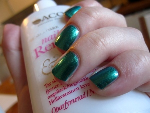
H&M Blue Bliss

 Remember how I talked about the many uses of a good black creme polish? Here’s a perfect example of what I mean!

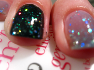
H&M Blue Bliss is a sheer blue jelly polish with small hex glitters in red, green, blue, teal and gold (and I think even some holos). On its own, even three coats leaves it extremely sheer and makes you look like you’re about to freeze to death. A look some may like, but certainly not one I strive for on a daily basis… ;)

If you layer it over black, however, it’s instantly transformed and the glitters really come through. Over black, it’s like a completely different polish: one at least I can’t stop looking at!

It sparkles and glitters and shifts colours as you move your fingers. Absolute brilliance!

Formula-wise, it’s easy to work with and dries quite quickly, unless you apply multiple coats. There’s no reason to do that, though, as the glitters come out of the bottle quite willingly and you don’t need more than one coat over your base to really make it pop.

H&M Look At Me

Remember Lady Luck from a week or so ago? Here’s another shimmery gem I picked up from a later trip to H&M.

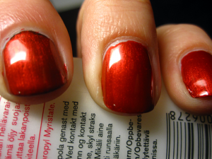
It’s called Look At Me and I can guarantee that that is exactly the statement your nails will make when you wear it. It’s a very vibrant, very shimmery red with an intense glow “from within.” I love it! (I wore it over OPI Lady in Black on my index finger, to see if the black made a big difference, and while it does make the glow deeper, it’s not absolutely necessary to make it look good.)

Like Lady Luck, this does run the risk of having brush strokes dry apparent, but with a little care while applying, it’s not really an issue. The formula is a little thin too, so if you have too much polish on the brush, you end up with fingers looking like mine in the photo here. ::cough::

All in all, lovely little thing, this. I can see myself wearing it for Christmas.

OPI Lady in Black

 I think young people these days are less likely to have a “little black dress” than they were a few decades ago. (I swear I’m not as old as that statement makes me sound!) It’s a pity, in my opinion, because the little black dress is such a versatile thing to have in one’s closet.

A good black creme is the “little black dress” of the nail polish world. It’s a great start for a lot of different styles of nail art. You can use it as a base under glitter polishes and layer it under other polishes where you want to make the colour deeper. Every polish addict should have one, and I dare say every polish addict does.

Until recently, my go-to black creme was Isadora’s Gothic black, which is awesome: it covers in one coat, dries quickly and is ridiculously shiny, even on its own. The only downside is that the bottle is quite small, and dries up quite quickly. I’ve employed my Seche Restore on it a few times already, but really felt I had to find a good alternative.

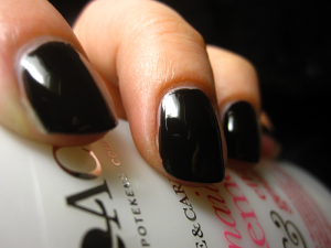
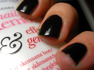
Enter OPI Lady in Black*. It’s super shiny. Super shiny! (No top coat used for these pics and look at those reflections on my nails!) It’s opaque in just two coats and you only need one if you want to layer something else over it.

Of course, swatching black polishes is kind of boring and it’s been done to death, but there you are. That’s what happens when a polish is a given staple in the collections of a lot of people with different tastes.

*I’m told this was previously known as OPI Black Onyx.

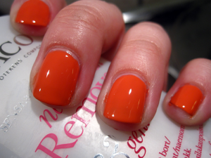
ELF Mango Madness

I posted about my first two ELF polishes the other day, and here’s my third! Purchased at the same time as the other two, this one is quite obviously a different shade.

I was swatching a little too late in the day, so the colour isn’t quite right, unfortunately. It has a much pinker tint than what the photos show. (I’ll try re-swatching at some point to get a fairer representation of it.)

That slight problem aside, it is a really gorgeous colour. Very summery, which makes it a bit of a pity that I only just tried in on now, when autumn is just about to start. There’s always next year, though! Or, of course, the prospect of what I like to think of as a vitamin injection for the darker months. =)

This is slightly more true-to-life, but still not pink enough.

Formula wise? It’s a bit thicker than the other two ELFs I tried. I think that’s the “new and improved” formula talking. Personally, I’m a big fan of the older version, so I’m not super pleased. To be fair, though, this isn’t bad, as such, just slightly thicker and harder to work with. I think I’ll survive it, though. ;) The worst is the fact that there’s still a hint of VNL even after three coats. Cool if you don’t mind VNL, but not so much if you do. I think I’ll layer it over a nude or white in the future.

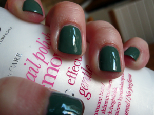
Depend #260

Green! I love me some green! It’s been my favourite colour ever since I outgrew my all-black phase, which was close to ten years ago (yelp! I’m getting old(er)!). Especially darker greens set my heart a-flutter, so of course I look for those colours in my nail polish choices as well.

Here’s one from Depend, again without a decent name. It is simply known as “260”, which is short and efficient, albeit dead dull. The polish itself is not. Dead dull, I mean. I don’t know how a polish would be short and efficient, so I can’t say if it is or isn’t…

Aaaaanyway, sidetracked! 260 is a gorgeous dark green creme. It looks a lot lighter in the bottle than it does on the nail, and quite a lot greyer/dustier too. There is a grey-ish element to it even when applied and dried, but it’s a much less marked element than what the bottle would have you believe. The formula is quite nice. I can’t remember if I used two or three coats here, but three is probably better to get rid of the last streakiness, unless you apply it with utmost care.

ELF Desert Haze and ELF Innocent: two peas in a pod?

I recently discovered ELF’s line of polishes and various other sundries. I was smitten at once: here was a budget brand with a huuuuge selection, and it was cruelty-free to boot! Obviously, my shopping fingers couldn’t keep away, and I clicked home a nice little selection for my first order.

Pictured to the right here is ELF Dezert Haze, a lovely nude shade that applies rather like a dream and covers quite well in two coats if you’re careful (three if you aren’t!). The formula is on the extremely thin side, but for some reason (the brush?), I didn’t find it hard to control or work with at all. Apparently, some of the other shades from ELF now feature a “new improved formula” and if the one I tried (more on that later) is anything to judge by, this means the formula is slightly thicker and, in my opinion, a wee bit trickier to work with. Not by a lot, though!

And here’s another photo of Desert Haze, right? Wrong!

This is supposed to be Innocent. On the website, they both belong to the same colour family, but Desert Haze is shown as a darker version of Innocent.
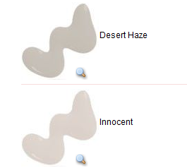
From the ELF website.

For the life of me, I cannot actually see a difference. I’ve tried different lights, I’ve tried squinting, I’ve tried everything, but I can’t see it. Maybe I’ve not yet acquired “the trained eye”, but I honestly think I accidentally got a mismarked bottle of one of these.

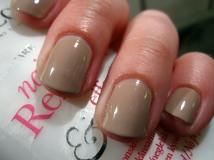
Dezert Haze on my thumb, Innocent on the other fingers. Can you see a difference?

I e-mailed ELF about it and this is what they had to say:

Having compared both of the samples here in the office I appreciate your feedback regarding the colour. Although they are similar, I can advise that both have different shades. While the Innocent is more nude and pink, Desert Haze has more brown undertones.

While they may appear very similarly on nails, I assure you that when swatched, side by side on white paper there is a clear colour difference.

I’m just going to have to swatch again and really look for that difference, I suppose.

Depend #297

 Depend’s polishes nearly never have colour names, just numbers, so here’s the aptly(? How could you tell?!) named #297, a matte pink creme, from the summer 2012 collection.

I pretty much hate shimmery pinks with a passion. Some glitter I can stomach, depending on the sort, but shimmer is never okay in my book. I feel like that makes things too princess-y, too little girl-y and too grandmother-y — all at once!

So, that being said, I’ve been on the hunt for a perfect pink for a while now. It needs to be pink (duh!), but not shimmery, and preferably a creme or a jelly, that covers well in max three coats and lasts for a while before chipping. Not, exactly, an easy task to find the perfect one, then. You’d think it would be, since there is a veritable sea of pinks out there, but apparently that just means there are more imperfections to wade through to find The One.

This is not it, unfortunately (The One, I mean). It’s not bad, though. It’s a pink non-shimmer creme that covers in two coats and dries matte. Awesome, thus far. Too bad it’s not the shade of pink I’m after. =( Also, to be honest, I prefer my matte shades to become matte by use of a top coat, rather than being that way from the beginning. Yay! for versatility and all that.

All in all, though my hunt goes on, this is something I will definitely be wearing from time to time. Application was a breeze and it’s not a bad shade, so thumbs up!

Oh, the hilarity!

I’m pretty sure everyone and anyone who has ever come into contact with spam absolutely loathes it, right? (I’m discussing the internet version here, of course. From what I understand, the meat-y equivalent is not always popular either, but at least it has some fans. And a pretty fantastic song!) I know I certainly do!

Occasionally, however, there’s a gem or two amongst the trash. Just look at these!

How is it that just anybody can create a weblog and get as popular as this? Its not like youve said something incredibly impressive more like youve painted a quite picture around an issue that you know nothing about! I dont want to sound mean, right here. But do you actually think that you can get away with adding some fairly pictures and not seriously say something?

This one is funny because of how ridiculously insulting it is, but also because, hello, this blog isn’t exactly popular! I think I have a grand total of two readers, and that’s being generous. ;)

obviously like your web-site but you have to take a look at the spelling on quite a few of your posts. Many of them are rife with spelling problems and I to find it very troublesome to inform the truth on the other hand I will certainly come again again.

Apparently, spelling isn’t my forte. Just like grammar isn’t the spammer’s. xD

H&M Lady Luck

Green and glittery? Don’t mind if I do!

I grabbed this from H&M a little while back along with some other goodies. I wasn’t actually planning on this one, but then I saw it and just had to have. Y’know, the way you sometimes just do? Yeah, like that.

It’s a little brush-stroke-y if you’re not careful, but with meticulous application (and it goes on like butter, so it’s easy!), it looks just fab. Glowing, even. I blame the micro glitters for that. I mean blame in a totally good way here, just so we’re clear. I like the micro glitters. I like them a lot. They are green and they are golden and they sparkle like mad.

Anyway, I can really recommend H&M’s Lady Luck if you want a bit of sparkly clover green on your finger tips!

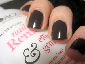
Isadora Metropolitan

You saw Night Flight yesterday, so here’s the next one from Isadora’s autumn collection: Metropolitan.

Metropolitan is a straight-up creme with no bells or whistles (i.e. shimmer, glitter, whathaveyous). Does that mean it’s boring? NO!

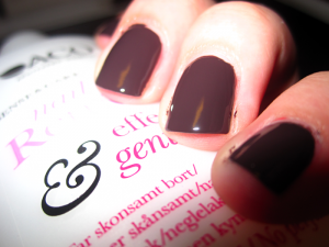
The formula is fantastic and application is a breeze (forgiven my sloppiness evident in the photos — I was kind of in a rush while swatching. Seriously bad combination of things to be/do). It’s opaque in two coats and the colour is a dark taupe, kind of like really dark coffee with just a drop or two of milk. Amaaaaaazing!

Also, it’s really shiny. Isadora polishes usually are, even without top coat, which is one of the reasons I love them so.

Crappy flash photography that at least kind of shows that little bit of milk.

There’s a third polish in the Paradox collection, a deep red creme, but I haven’t bought it yet and I’m not sure if I will either. I have a lot of reds already, but my stash was lacking in brown and blues, which is why I picked up the other two colours first.

Night Flight

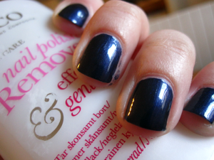
This is one of three polishes from Isadora’s fall 2012 collection: Paradox.  It’s a gorgeous dark blue metallic that covers in two coats, three if you want perfection, and I really, really like it a lot. It has a slight silver shimmer to it, which is absolutely lovely. Shimmers aren’t usually my thing, but here I think it really works.

I don’t think I’ve ever been really disappointed by an Isadora polish. They usually cover really well in just a few coats and they last an amazingly long time before they start to chip, especially if you use a good base/top coat combo.

I’ve only swatched this so far, but you can be sure I’ll be wearing it a lot this season.

Post Navigation